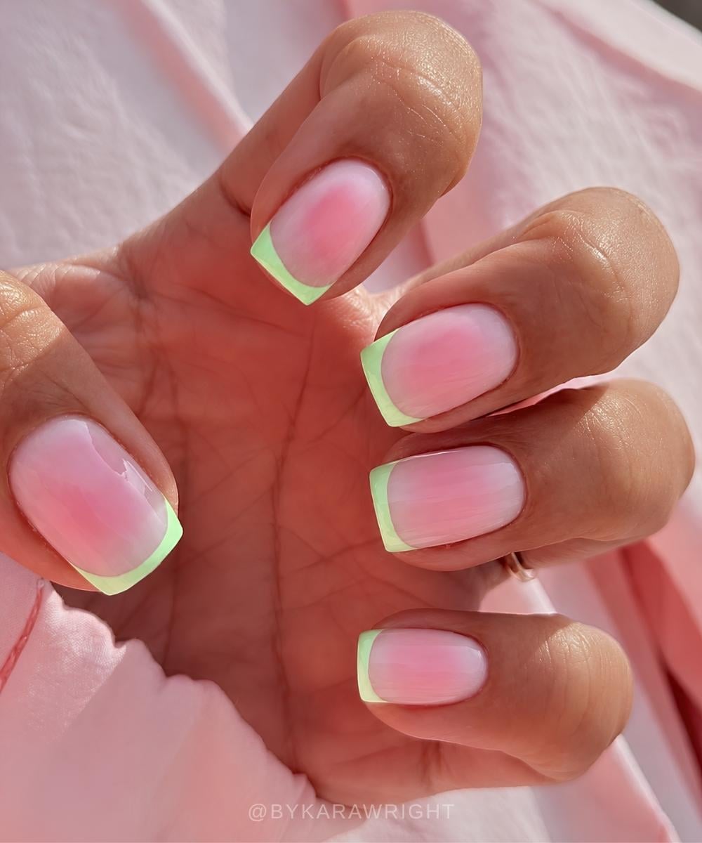
Two-tone nails are exactly what they sound like: one manicure, two shades, endless ways to use them. Go clean with French tips, graphic with color blocking, soft with an aura blend, or playful with swirls and mismatched details. There is no manicure police, but the color wheel can help you land on the exact mood – and if you read The Pink Issue regularly, you already know I’m way too invested in color theory.
Shades from the same color family give you that smooth, blended finish that works beautifully for gradients, aura nails, and softer designs. Opposite or high-contrast colors bring the drama, making French tips, bold blocks, and tiny graphic details hit much harder.
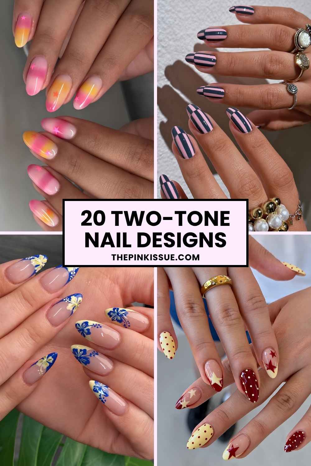
Ahead, 20 two-tone nail pairings for 2026, plus why each combo works and the polish shades to recreate them.
1. Pink + Green = Complementary, Toned Down
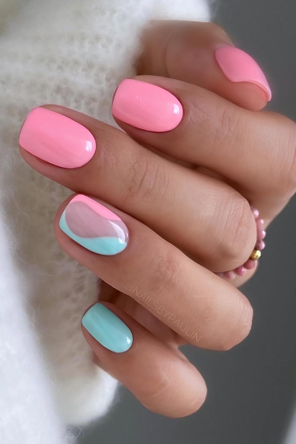
Pink is just lightened red, and red faces green across the wheel, which makes this a complementary duo with the volume turned down. It’s a natural for spring and summer manis, and it rewards clean shapes: color blocking, swirls, florals, fruit art, negative space, or a green tip over a pink base.
Go soft with Essie Fiji and Mint Candy Apple, or crank the contrast with OPI Strawberry Margarita against Rated Pea-G.
2. Yellow + Red = Warm Color-Wheel Neighbors
Red and yellow are two primaries with orange sitting between them, which lands them just shy of analogous: closely related, both warm, pure vintage-poster energy. Because they shade into orange so easily, a sunset mani is the natural move, though the combo is just as strong in sharper designs: flames, stars, dots, checkerboards, or straight color blocks.
Go high-impact with Essie Forever Yummy and All Fun & Games, or take it moodier with Berry Naughty, a deep berry red, against the soft Buttercup Jelly.
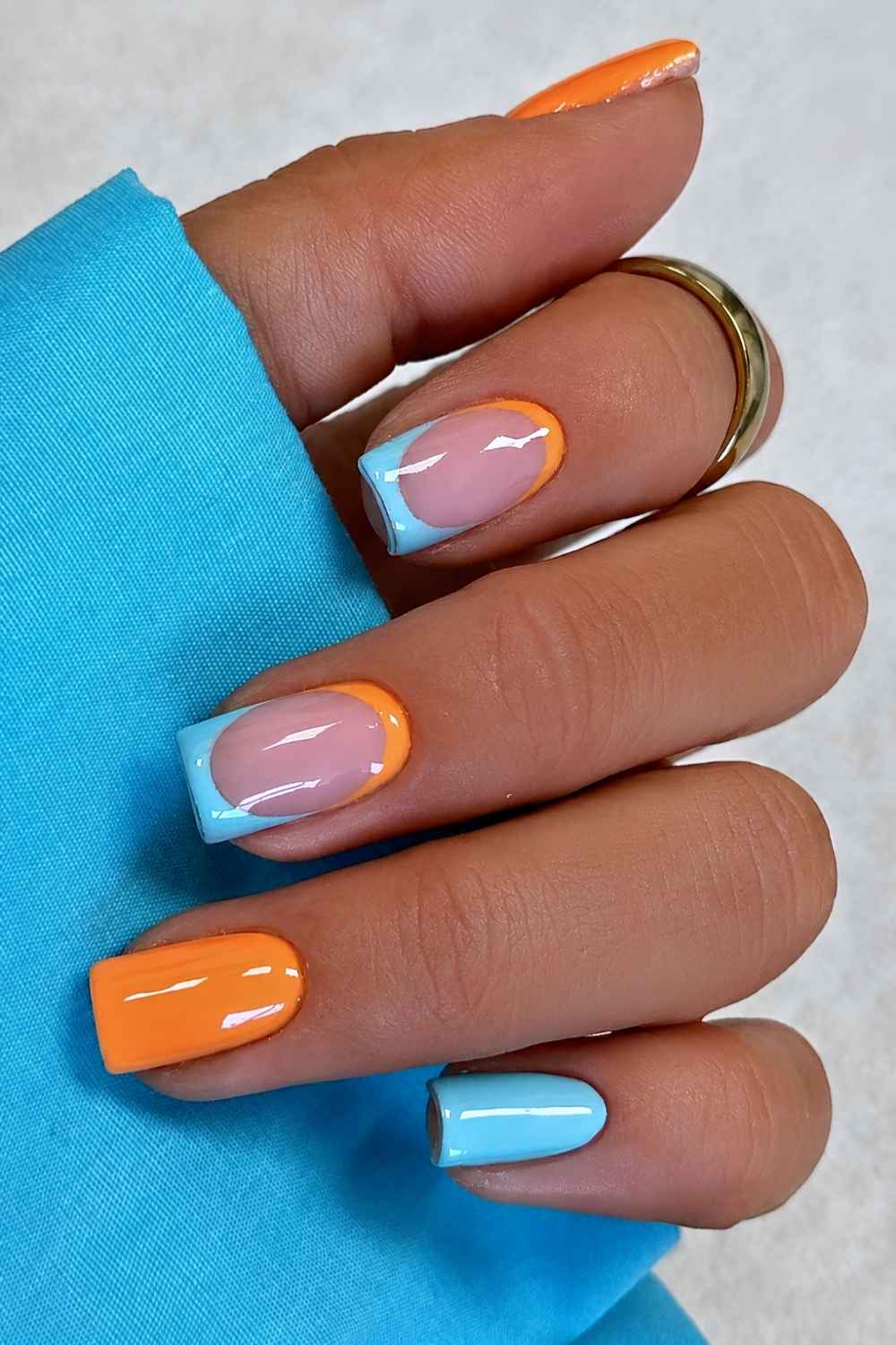
3. Brown + Blue = Complementary, Muted
Brown is just a dialed-down orange, and orange is blue’s opposite, so this is the same complementary tension as blue and tangerine, only earthed down. Brown and blue combo goes sharp and graphic just as easily as it goes soft: color blocking, a blue accent over tortoiseshell, polka dots and swirls, or an aura fade. And it carries across seasons, as at home in fall as in July.
Pair Essie All Checked Out, a creamy brown, with Bikini So Teeny, a soft cornflower blue that keeps the whole thing from reading too heavy.
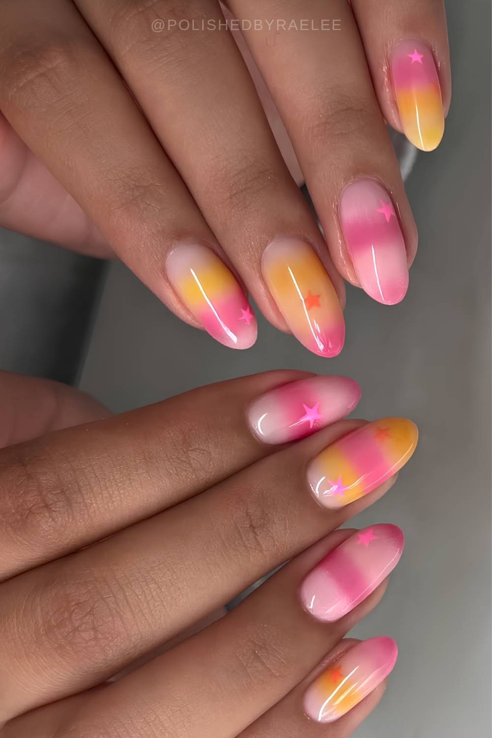
4. Pink + Orange = Analogous and Warm Colors
Analogous colors are neighbors on the wheel, and pink and orange both live in the warm red zone (pink is a red tint, orange is red plus yellow). They share enough that there’s no tension, and that’s exactly why they blend so well. This is the pair for gradients, ombré, aura, and jelly nails, and looks just as good with more graphic spring and summer nail art.
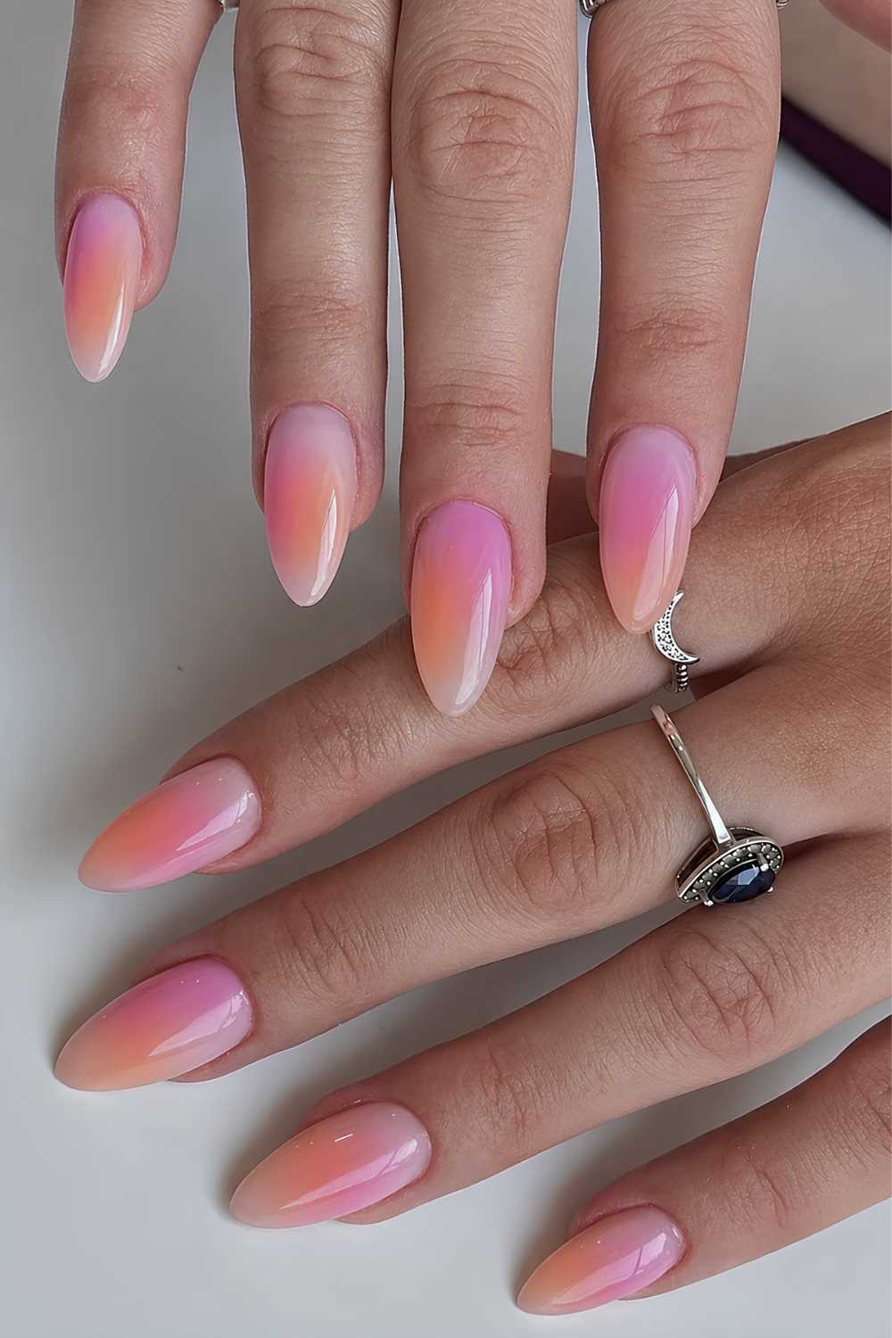
Split them by intensity for the sharpest result: go full saturation with OPI Beat Goes Neon and On with Bright on Top, or keep it gentle with OPI Faux-ever Yours with Within Peach.
5. Blue + Yellow = Two Primaries, Cool vs Warm
Blue and yellow aren’t opposites on the wheel, so their punch doesn’t come from a complementary clash. It runs on temperature and brightness instead: yellow is the lightest hue going, blue one of the deepest, one warm and one cool. That built-in distance is why the pair reads sharp in anything graphic, from polka dots and stripes to lemon motifs, trendy florals, and clean color-blocked sets.
For high impact, pair Orly It’s Brittney, Beach with their punchy yellow Sour Time To Shine. Want a softer version? OPI Sunny Bunny against the powdery Baby Blue Me Away does it.
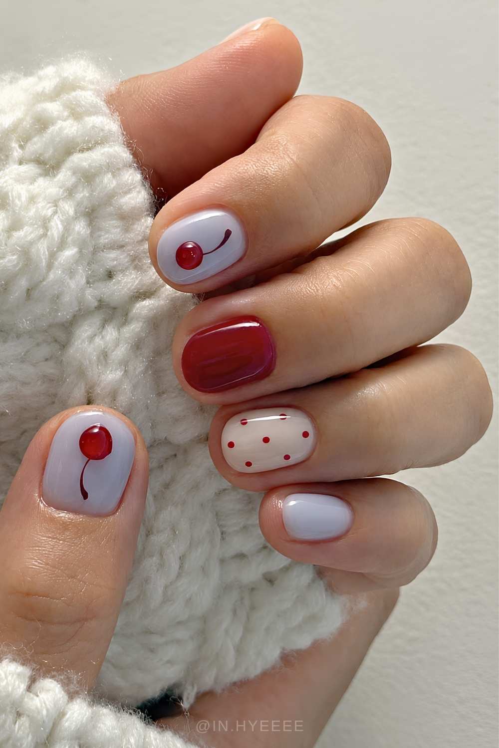
6. Black + Red = Bold Against Neutral
Since black carries no hue of its own, it works on value, deepening a saturated red until it looks richer and more expensive. Red and black are the most enduring high-contrast pair on the list, equal parts gothic, dark coquette, rockabilly, and old-Hollywood, and while it works any time of year, autumn is when it peaks. Wear it as color blocking, swirls, flames, hearts, cherry motifs, marble, ombré, or aura.
For polish, try OPI Black Onyx (true black) with Nailberry Rouge (classic red), both opaque for clean edges.
7. Pink + Blue = Warm vs Cool
Pink and blue are two primaries (well, pink is just red dialed down) with purple sitting between them, so this one runs on temperature: a warm shade against a cool one. Because the pink is softened, the pairing reads dreamy instead of harsh, which is why it carries aura nails, mermaid sets, and candy swirls just as happily as cleaner graphic work like negative space.
OPI Mod About You with Baby Blue Me Away keeps it pastel-sweet, but mid-tones are where this really lands – Essie Haute To Trot with OPI Snap Your Fingers.
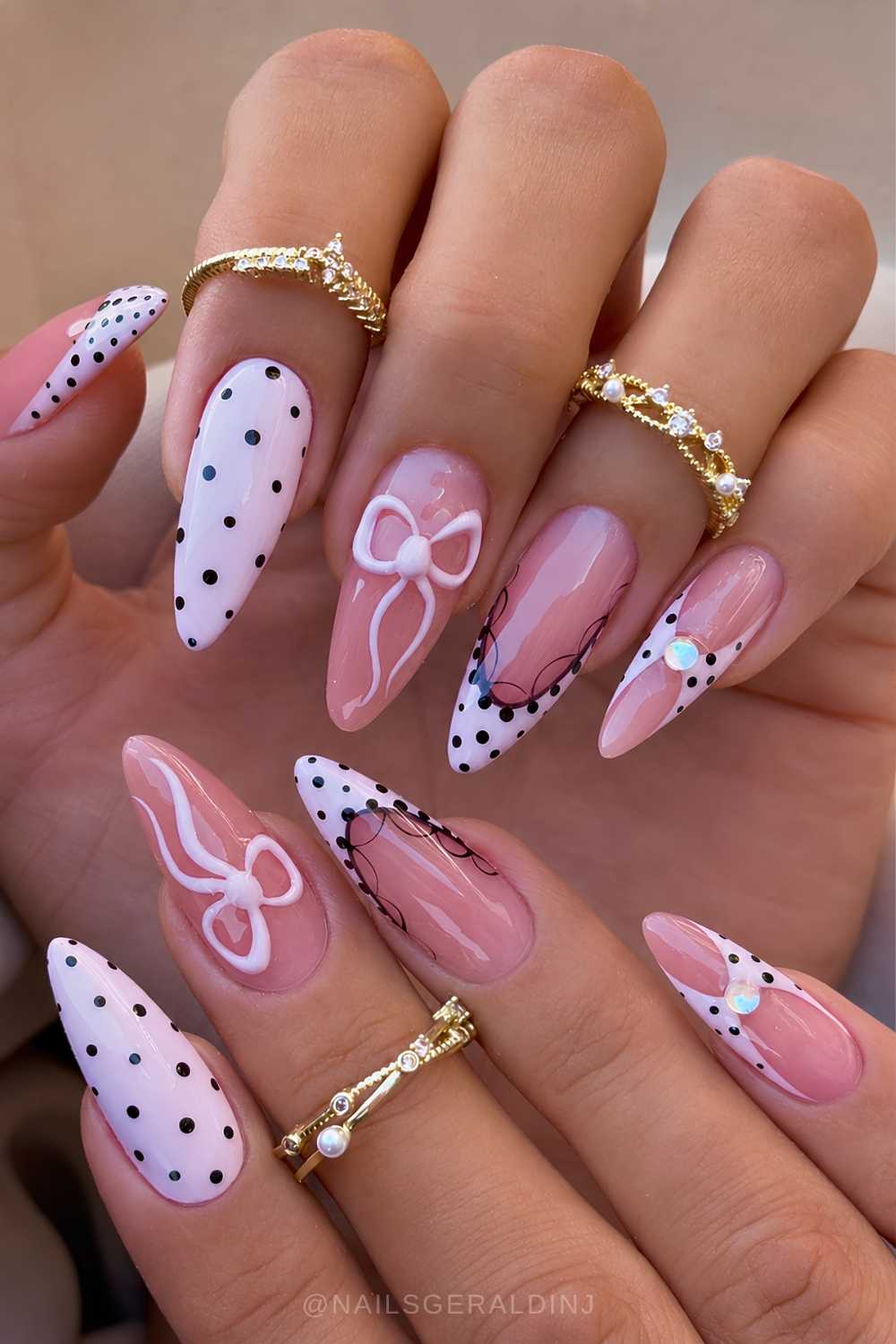
8. Black + White = Pure Value Contrast
No hue here at all, so this is really value blocking, not color: the darkest possible shade set against the lightest, and the entire effect rides on that gap. Black and white are the most versatile pair on the list, holding up across alternating solid nails, aura fades, and monochrome nail art of every kind, from florals and polka dots to bows and mod swirls. Works in any season, so no expiry date for this two-tone mani.
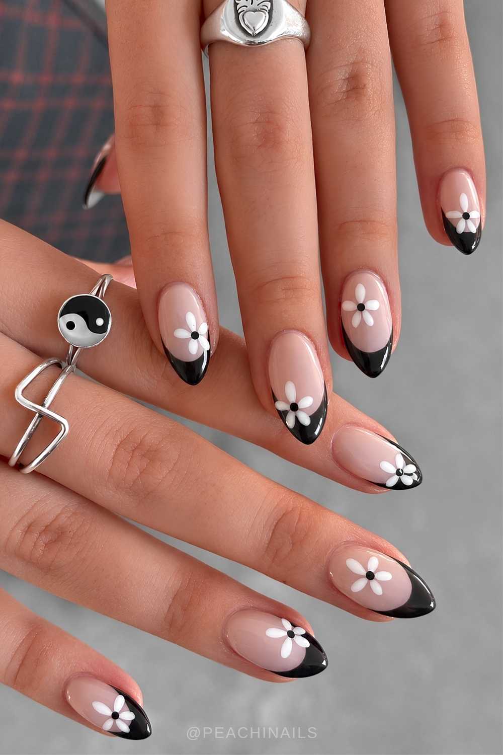
Just know there’s nowhere to hide, so you want a dense, true black and a flat, fully opaque white, like OPI Black Onyx with Alpine Snow.
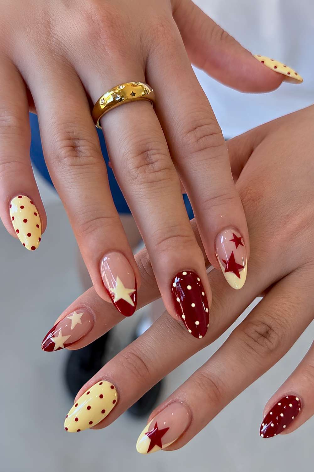
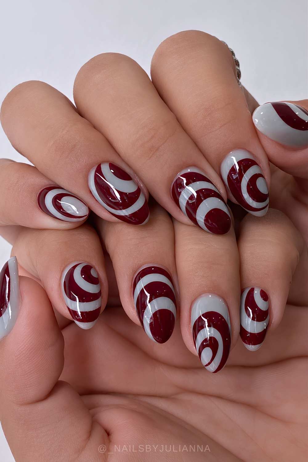
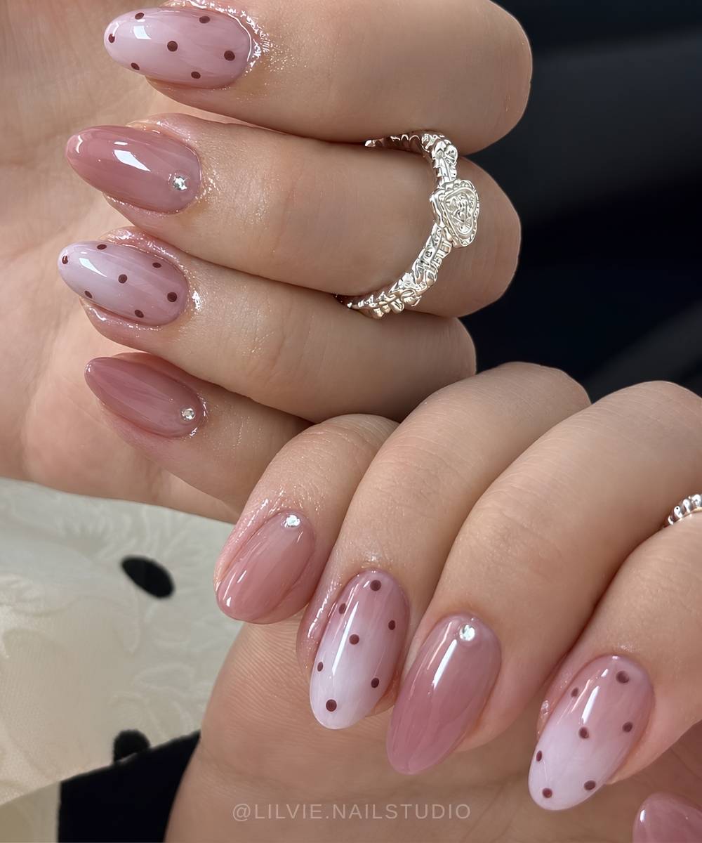
9. Red + Pink = One Hue, Two Values
This is monochrome, not a contrast: pink is just red with the volume turned down, so you’re working one shade at two strengths. That makes it the smoothest pair here for ombré, and it’s just as sharp in a tonal French or a graduated skittle set. It also takes to cutesy art (hence the Valentine’s nail staple status), but it carries spring and summer fine. And burgundy with a dustier pink shifts it into fall and winter manis.
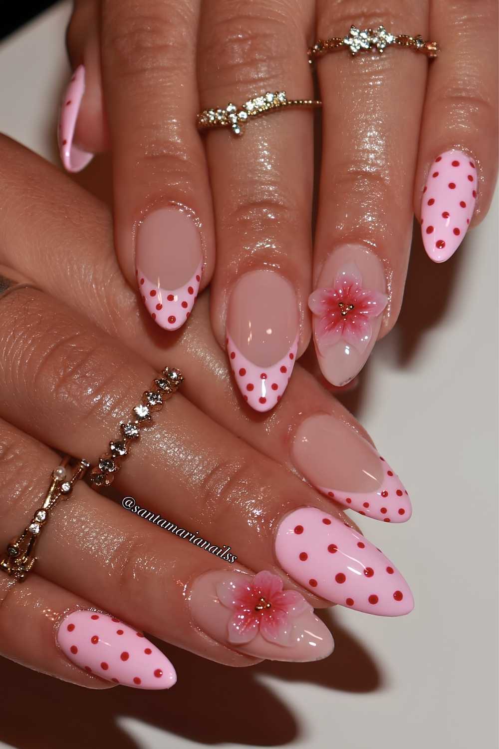
Pair a true red like OPI Big Apple Red with a soft Mod About You – the bigger the lightness gap, the more the two read as distinct shades rather than a near-match.
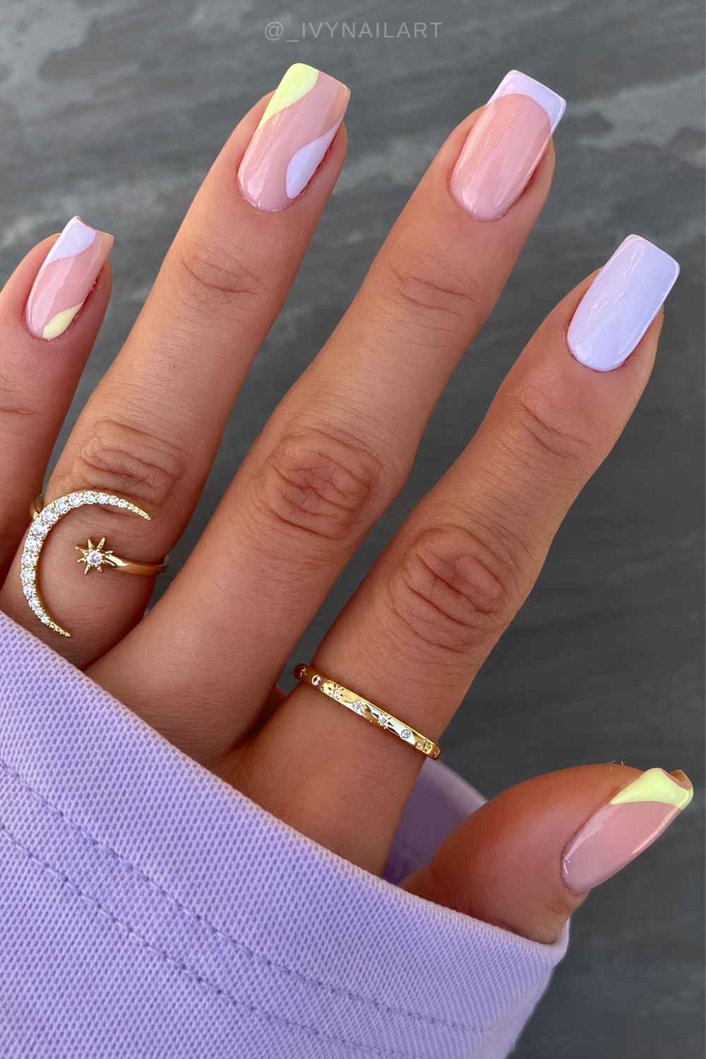
10. Blue + White = Bright Color, Clean Neutral
White has no hue, so it can’t fight the blue, only sharpen it. That makes blue + white an ideal combo for graphic work: color blocking, nautical stripes, polka dots, evil eye and blueberry art, wavy lines, gingham, marble, or tile motifs. And since blue runs the whole range from pale sky to deep navy, you can shift the shade to suit any time of year.
For a mid blue try Londontown Poolside Dreams, or Zoya Ryan for dark blue, both against a crisp white like OPI Alpine Snow.
11. Green + Brown = Earthy and Analogous
Brown and green both carry yellow undertones, which is why they sit together so naturally; this is the woodland, fall-coded pairing on the list. Keep enough value gap or they blur into camo, so go deep brown against a lighter green. It’s ideal for earthy gradients, botanical art, tortoiseshell, abstract work, plaid, or a clean two-tone block.
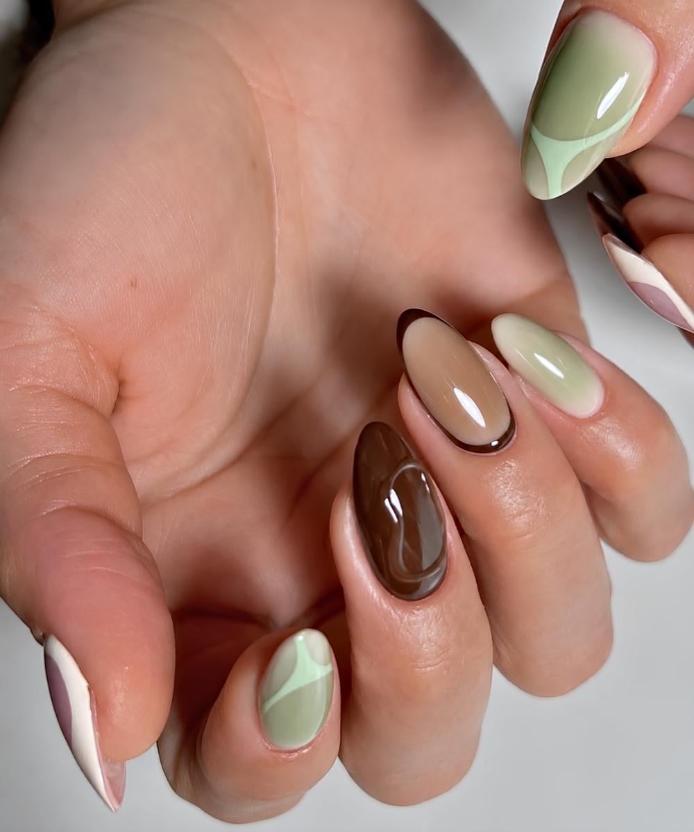
For a standout set, try Essie Crunch Crunch, a dusty seafoam green, with Essie Fringes & Saddle, a dark chocolate brown.
12. Black + Pink = Neutral Anchor, Bright Pop
Black has no hue, so it doesn’t compete with the pink; it deepens the contrast and lets the pink read louder against it. Neon pink goes full Y2K pop-punk, while soft pink feels more mod. The contrast is the whole point, so keep the art graphic: stars, dots, animal print, line work, bows, hearts, lace, or glitter for the full early-2000s mani treatment.
Try Essie Licorice with Orly That’s Hot for the bold version, or pair black with OPI Mod About You for a softer take.
13. Purple + Yellow = True Complementary Combo
Opposites on the wheel, which is as much contrast as two colors can give you. Add the value gap (yellow the lightest hue, purple among the deepest) and the color combo practically vibrates. It works bright or pastel, which makes it a flexible base for graphic spring and summer sets: color blocking, negative space, funky swirls, florals, or mix-and-match sets.
Reach for OPI Bright Back at It and Sunkissed and Tell, two vivid shades that keep the contrast crisp and playful.
14. Blue + Red = Two Primaries, Full Saturation
Blue and red sit on either side of purple, both deep, one cool and one warm. They’re not complementary, so the punch comes from sheer distance plus the temperature split, and at full saturation it reads bold and a little nautical. Best kept crisp: stripes, stars, a colored French, cherries, florals, and every Memorial Day/Fourth of July mani you’ll ever do.
Reach for OPI Mi Casa Es Blue Casa, a rich crème cobalt, and pair it with Big Apple Red, the brand’s most reliable true red.
15. Pink + Yellow = Both Warm, Both Light
Orange sits between pink and yellow on the wheel, so they’re close enough to share warmth but far enough to stay distinct. The result reads soft and high-key, which is why yellow and pink fade so easily into gradients and aura sets, and the sweetness practically begs for playful art: daisies, stripes, bees, polka dots or little swirls.
Go full feel-good with Essie Lovie Dovie, a flamingo pink, and OPI Blinded by the Ring Light, a pastel yellow.
16. Beige + Brown = One Warm Family, Light to Dark
Beige is just pale, muted brown, so you’re working one warm neutral from light to deep. It’s the espresso-and-cream behind every latte and mocha mani, quiet and expensive-looking in any season. Same-family shades slide into each other for ombré and aura, stay sharp in French tips, soft blocks, or line art, and take a little glitter happily.
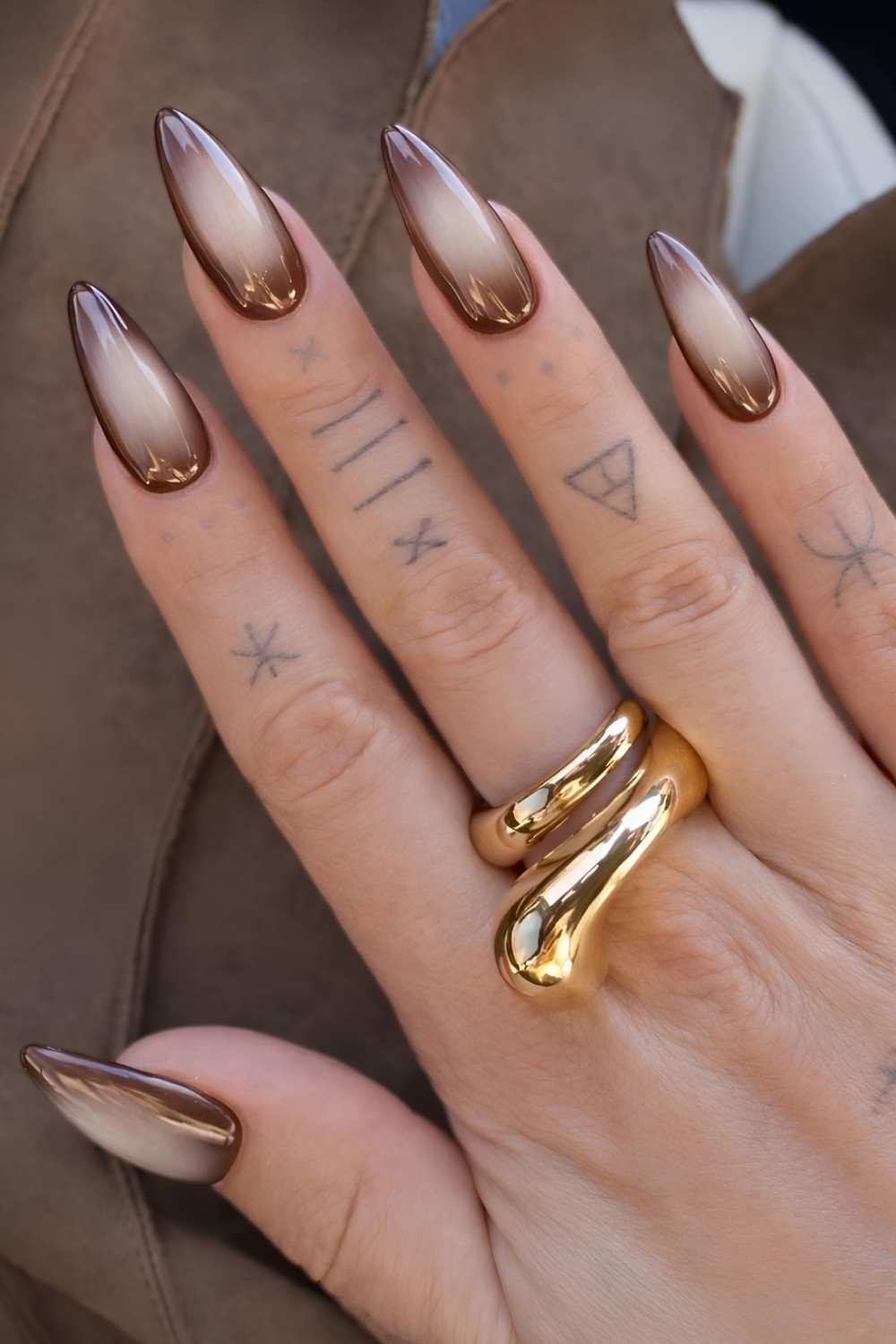
Try Manucurist Mocha (cool dark brown) with Dove Beige, a shade opaque enough to actually show up, leaving a value gap so the lighter one holds its ground.
17. Pink + Gray = Color Against Neutral
Gray has no hue of its own, so it doesn’t compete with pink, it just cools it down and gives it some weight, which is what turns a sweet color into something sleek. It’s also one of the most wearable ways to do pink in any season, dressed up or down. The pairing leans clean by nature, so it suits sharp, simple designs: color blocking, thin stripes, a skittle set in alternating shades.
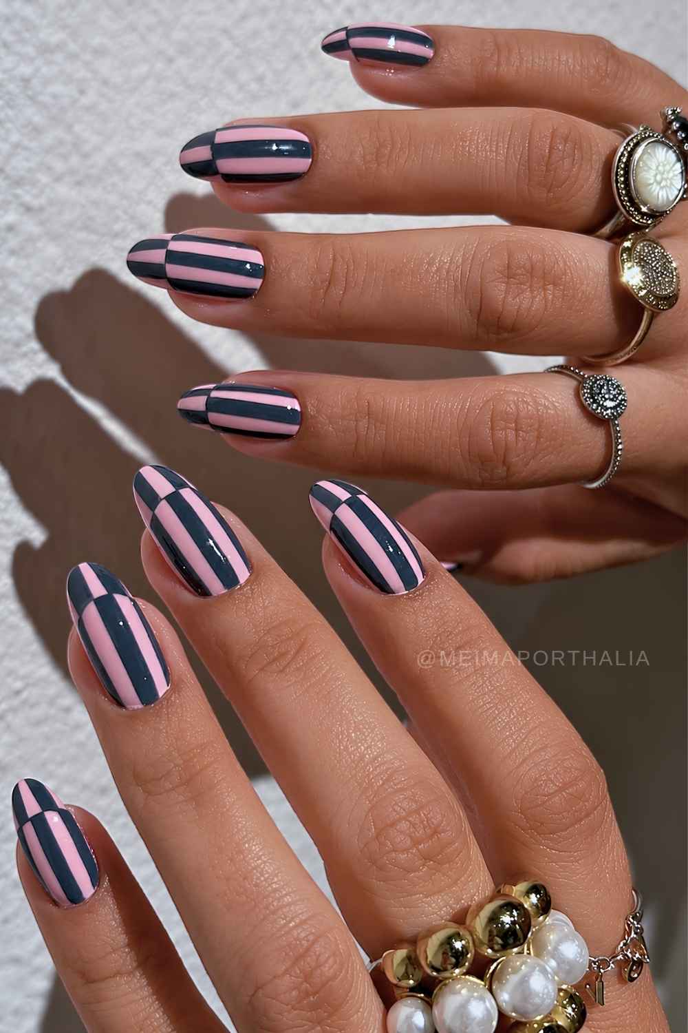
Pair Essie Chinchilly with OPI Mod About You for a soft, tonal take, or reach for a charcoal gray like Essie On Mute when you want the contrast to actually snap.
18. Blue + Orange = True Complementary
The textbook pairing. Blue and orange sit directly opposite on the wheel, so you get maximum hue contrast plus a full warm-cool split on top of it. This combo was basically built for color blocking, even in simple designs like full coverage, French tips, negative space, and abstract shapes. It also hits hard with fruit art, stripes, and picnic manis.
For a bold pairing, try Static Nails Cabana Boy, a bright mid-blue, with Manucurist Sunset, a warm orange.
19. Brown + Yellow = Same Color Family, Different Depth
Brown is just a deep, muted yellow-orange, so the two sit in one warm family at opposite ends of the depth scale rather than clashing. The result reads cozy and a little ’70s, and it bridges seasons nicely: brown carries yellow into fall, yellow lightens brown for spring and summer. The combo loves polka dots, stripes, tortie shell, and especially a hit of gold detailing.
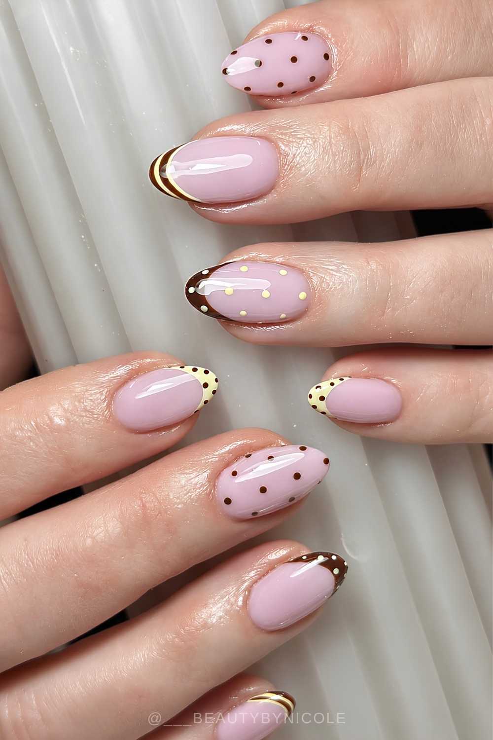
For polish, try ILNP Chocolate with OPI Sunny Bunny, both lovely in a color-blocked design.
20. Mauve + White = Muted and Grounded
Mauve is already quiet because it sits between dusty pink and muted purple, and white keeps it crisp instead of candy-sweet. The result is soft, grounded and a little more grown-up than the usual pastel combo. Go for a mauve French on a milky white base, soft color blocking, tiny polka dots, fine line art or a minimal swirl.
Pair The Gelbottle Peacci Deepest Mauve with Essie Blanc for something elegant and easy to wear.
And that’s how we’re wearing two-tone nails in 2026. Tell me your favorite combo in the comments, and if this post helped you pick your next mani, sharing it is the easiest way to support The Pink Issue.